作者: afenxi来源: afenxi时间:2017-06-14 10:15:39
摘要:看完这篇文章,可视化不再是难题。
ggfortify 是一个简单易用的R软件包,它可以仅仅使用一行代码来对许多受欢迎的R软件包结果进行二维可视化,这让统计学家以及数据科学家省去了许多繁琐和重复的过程,不用对结果进行任何处理就能以 ggplot 的风格画出好看的图,大大地提高了工作的效率。
ggfortify 已经可以在 CRAN 上下载得到,但是由于最近很多的功能都还在快速增加,因此还是推荐大家从 Github 上下载和安装。
library(devtools) install_github(sinhrks/ggfortify) library(ggfortify)
接下来我将简单介绍一下怎么用 ggplot2 和 ggfortify 来很快地对PCA、聚类以及LFDA的结果进行可视化,然后将简单介绍用 ggfortify 来对时间序列进行快速可视化的方法。
PCA (主成分分析)
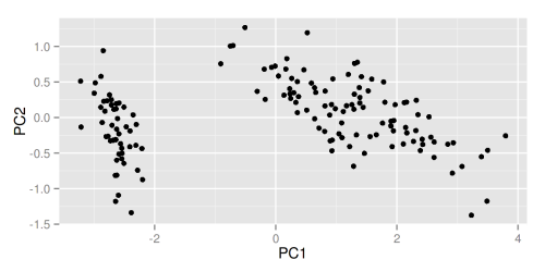
ggfortify 使 ggplot2 知道怎么诠释PCA对象。加载好 ggfortify 包之后, 你可以对stats::prcomp 和 stats::princomp 对象使用 ggplot2::autoplot。
library(ggfortify) df <- iris[c(1, 2, 3, 4)] autoplot(prcomp(df))
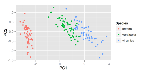
 你还可以选择数据中的一列来给画出的点按类别自动分颜色。输入help(autoplot.prcomp) 可以了解到更多的其他选择。
autoplot(prcomp(df), data = iris, colour = Species)
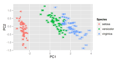
 比如说给定label = TRUE 可以给每个点加上标识(以rownames为标准),也可以调整标识的大小。
autoplot(prcomp(df), data = iris, colour = Species, label = TRUE, label.size = 3)
 给定 shape = FALSE 可以让所有的点消失,只留下标识,这样可以让图更清晰,辨识度更大。
autoplot(prcomp(df), data = iris, colour = Species, shape = FALSE, label.size = 3) 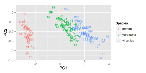
给定 loadings = TRUE 可以很快地画出特征向量。
autoplot(prcomp(df), data = iris, colour = Species, loadings = TRUE)
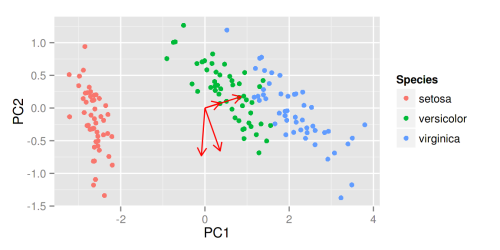 同样的,你也可以显示特征向量的标识以及调整他们的大小,更多选择请参考帮助文件。
autoplot(prcomp(df), data = iris, colour = Species, loadings = TRUE, loadings.colour = blue, loadings.label = TRUE, loadings.label.size = 3) 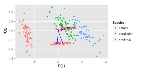 因子分析
因子分析
和PCA类似,ggfortify 也支持 stats::factanal 对象。可调的选择也很广泛。以下给出了简单的例子:
注意 当你使用 factanal 来计算分数的话,你必须给定 scores 的值。
d.factanal <- factanal(state.x77, factors = 3, scores = regression) autoplot(d.factanal, data = state.x77, colour = Income) 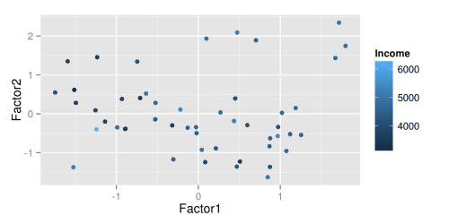
autoplot(d.factanal, label = TRUE, label.size = 3, loadings = TRUE, loadings.label = TRUE, loadings.label.size = 3) 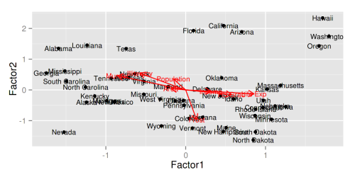 K-均值聚类
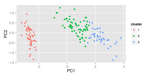
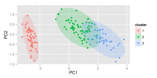
autoplot(kmeans(USArrests, 3), data = USArrests) 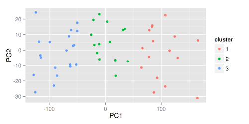
autoplot(kmeans(USArrests, 3), data = USArrests, label = TRUE, label.size = 3) 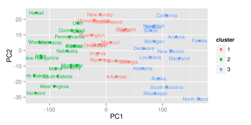 其他聚类
其他聚类
ggfortify 也支持 cluster::clara, cluster::fanny, cluster::pam。
library(cluster) autoplot(clara(iris[-5], 3))
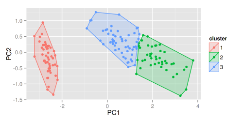
 给定 frame = TRUE,可以把 stats::kmeans 和 cluster::* 中的每个类圈出来。
autoplot(fanny(iris[-5], 3), frame = TRUE)
 你也可以通过 frame.type 来选择圈的类型。更多选择请参照 ggplot2::stat_ellipse里面的 frame.type 的 type 关键词。
autoplot(pam(iris[-5], 3), frame = TRUE, frame.type = norm)
 更多关于聚类方面的可视化请参考 Github 上的 Vignette 或者 Rpubs 上的例子。
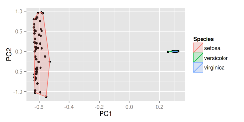
lfda(Fisher局部判别分析)
lfda 包支持一系列的 Fisher 局部判别分析方法,包括半监督 lfda,非线性 lfda。你也可以使用 ggfortify 来对他们的结果进行可视化。
library(lfda) # Fisher局部判别分析 (LFDA) model <- lfda(iris[-5], iris[, 5], 4, metric="plain") autoplot(model, data = iris, frame = TRUE, frame.colour = Species) 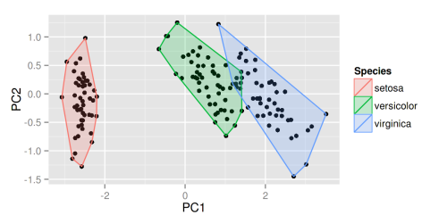
# 非线性核Fisher局部判别分析 (KLFDA) model <- klfda(kmatrixGauss(iris[-5]), iris[, 5], 4, metric="plain") autoplot(model, data = iris, frame = TRUE, frame.colour = Species)
 注意 对 iris 数据来说,不同的类之间的关系很显然不是简单的线性,这种情况下非线性的klfda 影响可能太强大而影响了可视化的效果,在使用前请充分理解每个算法的意义以及效果。
# 半监督Fisher局部判别分析 (SELF) model <- self(iris[-5], iris[, 5], beta = 0.1, r = 3, metric="plain") autoplot(model, data = iris, frame = TRUE, frame.colour = Species) 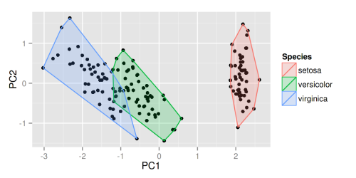 时间序列的可视化
用 ggfortify 可以使时间序列的可视化变得极其简单。接下来我将给出一些简单的例子。
ts对象
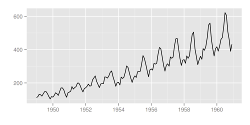
library(ggfortify) autoplot(AirPassengers)
 可以使用 ts.colour 和 ts.linetype 来改变线的颜色和形状。更多的选择请参考help(autoplot.ts)。
autoplot(AirPassengers, ts.colour = red, ts.linetype = dashed) 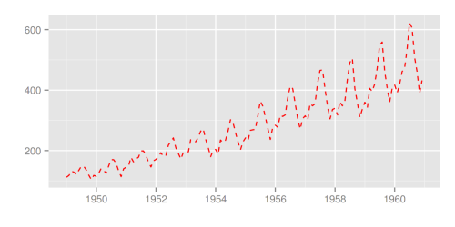 多变量时间序列
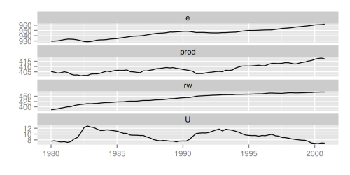
library(vars) data(Canada) autoplot(Canada)
 使用 facets = FALSE 可以把所有变量画在一条轴上。
autoplot(Canada, facets = FALSE) 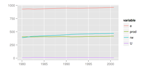
autoplot 也可以理解其他的时间序列类别。可支持的R包有:
zoo::zooreg xts::xts timeSeries::timSeries tseries::irts
一些例子:
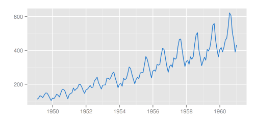
library(xts) autoplot(as.xts(AirPassengers), ts.colour = green) 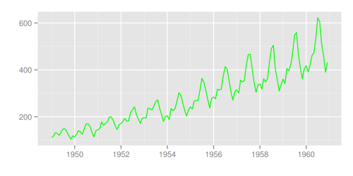
library(timeSeries) autoplot(as.timeSeries(AirPassengers), ts.colour = (dodgerblue3))
 你也可以通过 ts.geom 来改变几何形状,目前支持的有 line, bar 和 point。
autoplot(AirPassengers, ts.geom = bar, fill = blue) 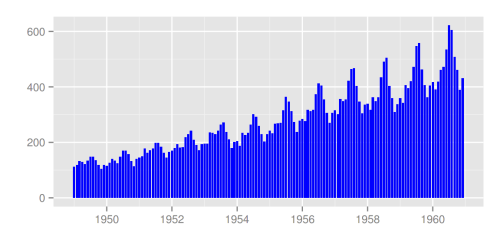
autoplot(AirPassengers, ts.geom = point, shape = 3) 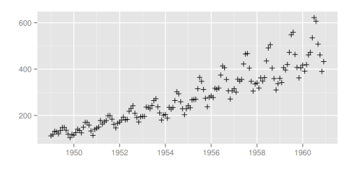 forecast包
library(forecast) d.arima <- auto.arima(AirPassengers) d.forecast <- forecast(d.arima, level = c(95), h = 50) autoplot(d.forecast)
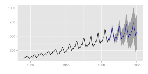 有很多设置可供调整:
autoplot(d.forecast, ts.colour = firebrick1, predict.colour = red, predict.linetype = dashed, conf.int = FALSE) 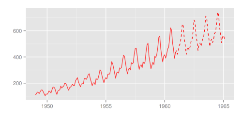 vars包
vars包
library(vars) data(Canada) d.vselect <- VARselect(Canada, lag.max = 5, type = const)$selection[1] d.var <- VAR(Canada, p = d.vselect, type = const) autoplot(predict(d.var, n.ahead = 50), ts.colour = dodgerblue4, predict.colour = blue, predict.linetype = dashed) 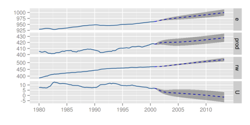 changepoint包
library(changepoint) autoplot(cpt.meanvar(AirPassengers)) 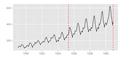
autoplot(cpt.meanvar(AirPassengers), cpt.colour = blue, cpt.linetype = solid) 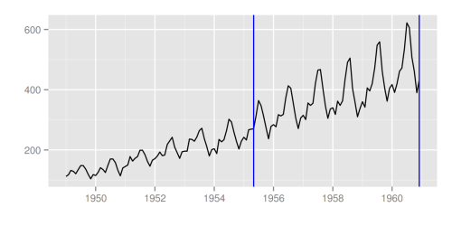 strucchange包
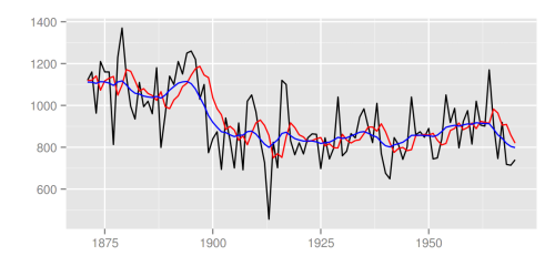
library(strucchange) autoplot(breakpoints(Nile ~ 1), ts.colour = blue, ts.linetype = dashed, cpt.colour = dodgerblue3, cpt.linetype = solid) 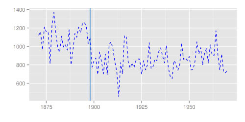 dlm包
dlm包
library(dlm) form <- function(theta) model <- form(dlmMLE(Nile, parm = c(1, 1), form)$par) filtered <- dlmFilter(Nile, model) autoplot(filtered) 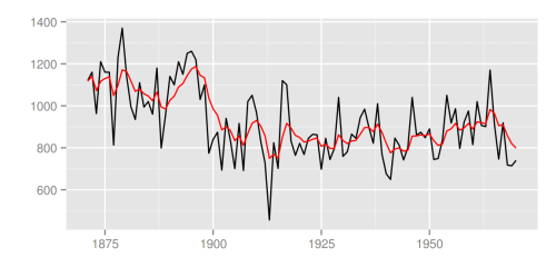
autoplot(filtered, ts.linetype = dashed, fitted.colour = blue) 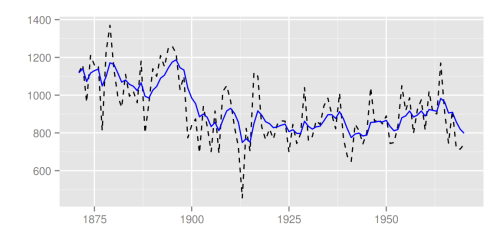
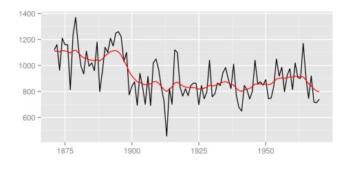
smoothed <- dlmSmooth(filtered) autoplot(smoothed) 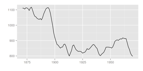
p <- autoplot(filtered) autoplot(smoothed, ts.colour = blue, p = p) 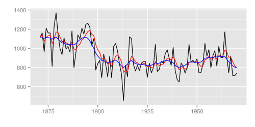 KFAS包
KFAS包
library(KFAS) model <- SSModel( Nile ~ SSMtrend(degree=1, Q=matrix(NA)), H=matrix(NA) ) fit <- fitSSM(model=model, inits=c(log(var(Nile)),log(var(Nile))), method="BFGS") smoothed <- KFS(fit$model) autoplot(smoothed)
 使用 smoothing=none 可以画出过滤后的结果。
filtered <- KFS(fit$model, filtering="mean", smoothing=none) autoplot(filtered) 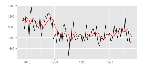
trend <- signal(smoothed, states="trend") p <- autoplot(filtered) autoplot(trend, ts.colour = blue, p = p)
 stats包
可支持的stats包里的对象有:
stl, decomposed.ts acf, pacf, ccf spec.ar, spec.pgram cpgram
autoplot(stl(AirPassengers, s.window = periodic), ts.colour = blue) 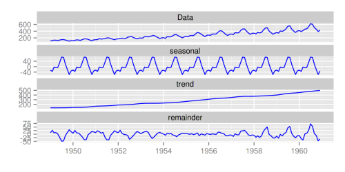
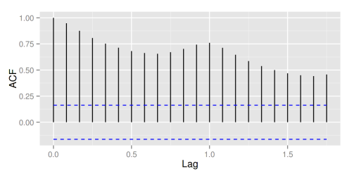
autoplot(acf(AirPassengers, plot = FALSE))
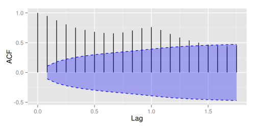
autoplot(acf(AirPassengers, plot = FALSE), conf.int.fill = #0000FF, conf.int.value = 0.8, conf.int.type = ma)
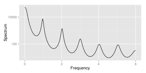
autoplot(spec.ar(AirPassengers, plot = FALSE))
ggcpgram(arima.sim(list(ar = c(0.7, -0.5)), n = 50)) 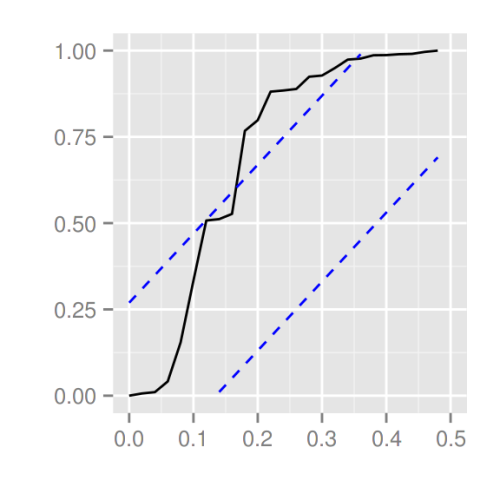
library(forecast) ggtsdiag(auto.arima(AirPassengers)) 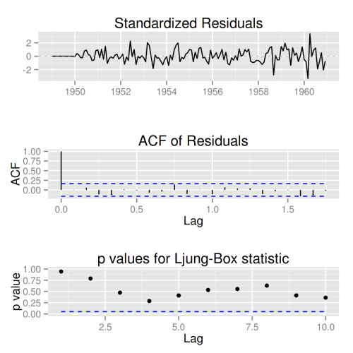
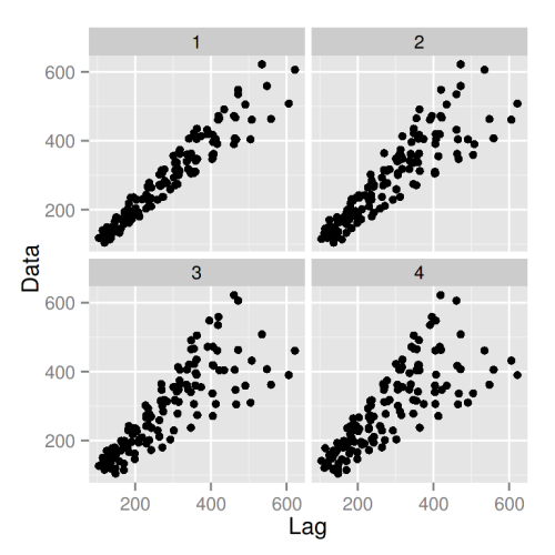
gglagplot(AirPassengers, lags = 4)
更多关于时间序列的例子,请参考 Rpubs 上的介绍。
最近又多了许多额外的非常好用的功能,比如说现在已经支持 multiplot 同时画多个不同对象,强烈推荐参考 Rpubs 以及关注我们 Github 上的更新。
祝大家使用愉快!有问题请及时在Github上 报告。(可以使用中文)
本文作者: 唐源,目前就职于芝加哥一家创业公司,曾参与和创作过多个被广泛使用的 R 和 Python 开源项目,是 ggfortify,lfda,metric-learn 等包的作者,也是 xgboost,caret,pandas 等包的贡献者。(喜欢爬山和烧烤)
原创文章,作者:数据特工,如若转载,请注明出处:《用一行R代码,实现繁琐的数据可视化》http://www.afenxi.com/post/3671